Designing for High Performance
The Power of Visual Hierarchy
Unlocking the potential of equipment design
Designing for High Performance
Have you ever found yourself in a high-pressure or high stakes situation, struggling to operate a piece of equipment or interface? Or maybe you’ve experienced the frustration of not being able to complete a task because the design was confusing and disorganized? As clinicians, these are some of the many challenges we face, and it’s crucial that we have access to well-designed equipment and interfaces that set us up for success every time. That’s where the strength of visual hierarchy comes in. In this post, I’ll share some key takeaways from my latest presentation on visible hierarchy in designing for high-performance and offer pointers on how visible hierarchy can be used to design for high performance.
| “Setup for Success.”
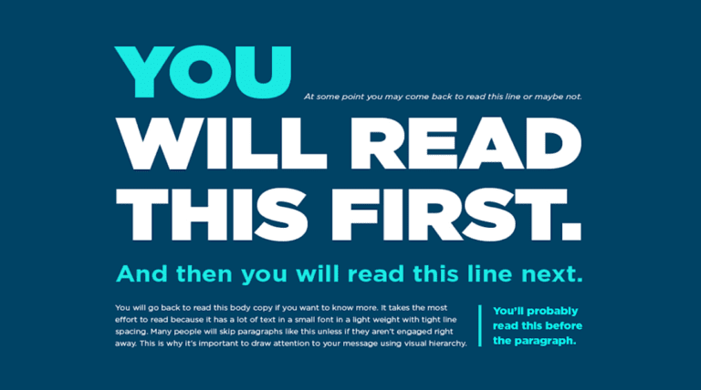
Good visual hierarchy design is essential where critical information must be easily accessible and understood. When you look at this picture figure 1 you are experiencing the power of visual hierarchy guiding you through the snippets of information in terms of their priority. This is done by applying Visual Hierarchy Principles for Effective Design
| “Stand Out and Make Sense“

1.Size matters: “Bigger is better for visual impact”.
The principle of size in visual hierarchy suggests that larger elements are perceived as more important than smaller ones. To make sure the most important elements stand out, use a larger size to draw attention and guide the user to the most relevant information.
2.Perspective creates an impact: “Depth and dimensionality make a difference”.
The use of perspective can create a sense of depth and dimensionality that draws the eye to important elements. By using different perspectives, you can create a visual hierarchy that leads the user through the design.
3.Use colour and contrast to draw attention: “Stand out with vibrant hues and bold contrasts”.
Using colour and contrast can help highlight key elements in a design. Bold colours or high-contrast elements can be used to create focal points and draw the eye to important information.
4.Fonts organise design: “Choose the right font to guide the eye”.
Fonts play a crucial role in organising information and creating a clear visual hierarchy. Using different fonts for different elements of a design can help create a clear structure and guide the user through the content.
5.Space provides emphasis and movement: “Breathing room can make a design come alive”.
The use of space can create emphasis and movement in a design. Negative space can be used to separate elements and draw attention to specific areas, while adding space around elements can create a sense of movement and flow.
6.Proximity suggests relationships: “Grouping items creates context and meaning”.
The principle of proximity suggests that elements that are closer together are perceived as being related. By grouping related elements together, you can create a clear hierarchy that guides the user through the design.
| ” Visual Clarity Enhances Performance: Utilising Visual Hierarchy“
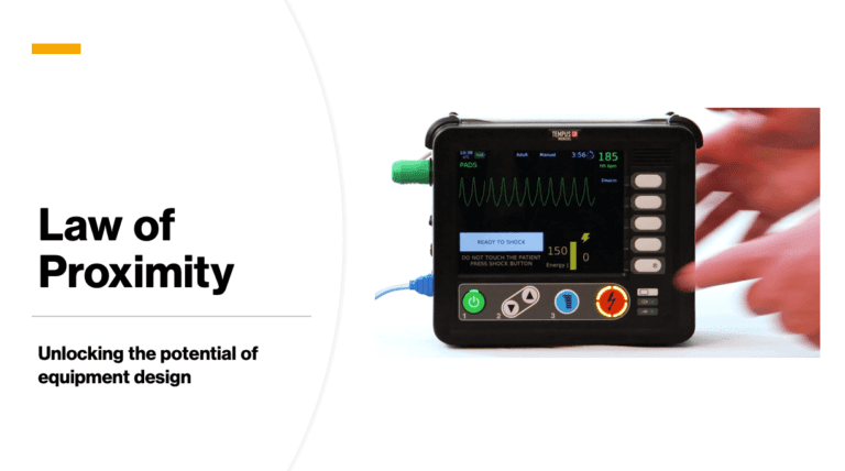
Figure 2 is the Tempus LS Manual Defibrillator this makes goos use of Visual hierarchy to organise information in a logical and intuitive way, which can improve usability and reduce cognitive load. By grouping elements that are related closer together like on this defibrillator – all the buttons needed to deliver the shock are presented in a logical way. When the machine charged there is both an audio tone and two visual prompts one as screen text “Ready to SHOCK” and the button to deliver the shock also illuminates directing you to the button to press. Reducing the time to shock delivery in cardiac arrest is important.

7.Negative space emphasises: “What you don’t show can be just as powerful”.
Negative space, also known as white space, is the area around and between elements in a design. Using negative space effectively can create a sense of emphasis and draw attention to specific elements.
8.Alignment directs eyes: “Keep everything in line for a cohesive look”.
Using alignment in a design can help guide the user’s eye through the content. By aligning elements to a grid or other visual guide, you can create a clear structure and hierarchy that makes the design easy to follow.
9.Repetition unifies a composition: “Consistency ties everything together”.
Using repetition can help create a sense of unity in a design. Repeating elements such as colours, shapes, or fonts can help unify the design and create a cohesive visual hierarchy.
10.Grids organise a design: “Structure your layout for maximum impact.
Using a grid can help create a clear structure and hierarchy in a design. By aligning elements to a grid, you can create a sense of order and guide the user through the content.
By utilising these principles, designers, manufactures and clinicians can collaborate more effectively can create equipment and interface that help to set clinicians up for success even on their worst day.
| “Cognition at its Core: Designing for mental load”
The amount of mental effort required to complete a task is known as the “cognitive load,” and it should be taken into account while creating tools. Equipment performance degrades and mistakes multiply when cognitive strain is made heavier by its design. Operators can work more effectively and make fewer mistakes when their mental workload is lightened. This can be accomplished by the use of short instructions, the removal of unnecessary distractions, and the provision of visual signals to help operators carry out their duties.
In conclusion, the design of healthcare equipment can benefit greatly by adhering to human-centred design concepts including ergonomics, human-machine interaction, visual hierarchy, data visualisation, and cognitive load. The more user-centred, ergonomic, intuitive, and simple the design, the more efficient the equipment will be for the end-user.
This is an example of one of the many decisions that we needed to make in the design of SCRAM™
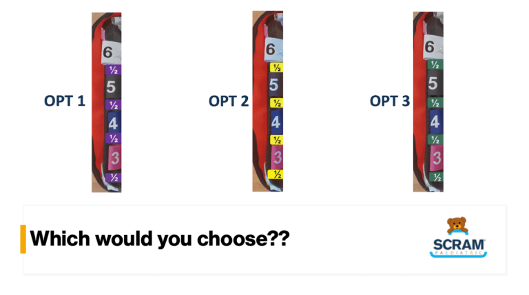
In the image below (fig 3) 3 options are presented that represent the colour schema of the different sizes of endotracheal tube (ETT).
So, which option would you choose?

Although option 2 with its high-contrast black on yellow colour scheme stands out, it is not the best choice because in high-stress environments, we tend to leverage gross motor indicators, which increases the risk of accidentally selecting the wrong tube size.
To avoid this, we chose a flat hierarchical design structure for the colour scheme, where all the endotracheal tubes (ETT’s) are equally important, but selecting the correct size is the top priority. This design ensures that the focus remains on the most important aspect of ett selection – choosing the correct size – without any distracting visual elements.
| “The right size for the right patient: Make the design work for you.”
- Good visual hierarchy layout is crucial for developing intuitive, clean interfaces.
- By utilising visual hierarchy, designers can enhance usability, lessen cognitive load, and in the long run create interfaces which are each visually appealing and highly practical.
- Visual hierarchy is a powerful tool for creating effective and user-friendly designs that are intuitive and able to reduce cognitive burden during high-stress, high-stakes situations
“Discover the Secrets to Unlocking Peak Performance in Healthcare.”
We all know that design plays a crucial role in the success of any product. But designing equipment with a focus on human performance can make all the difference in healthcare. By incorporating human-centered design principles such as ergonomics, human-machine interaction, visual hierarchy, data visualization, and cognitive load, we can create tools that not only serve their purpose but also enhance the experience and performance of the clinician. Let’s dive into the secrets to unlocking peak performance with equipment designed for humans!
Financial Disclosures
Unless otherwise stated at the top of the post, related parties have no relevant financial disclosures or conflict of interest.